Color has a powerful influence on mood, perception, and overall well-being. When used effectively in the home, it can shape how a space feels, enhance architectural features, and support the way a household functions. In a vibrant, design-forward community like Coconut Grove, Florida, where lifestyle and aesthetics go hand in hand, understanding how to use color psychology can help homeowners create spaces that feel as good as they look. Whether refreshing a single room or planning a full home redesign, strategic color choices offer one of the most effective ways to transform any environment.
Understanding the Basics of Color Psychology
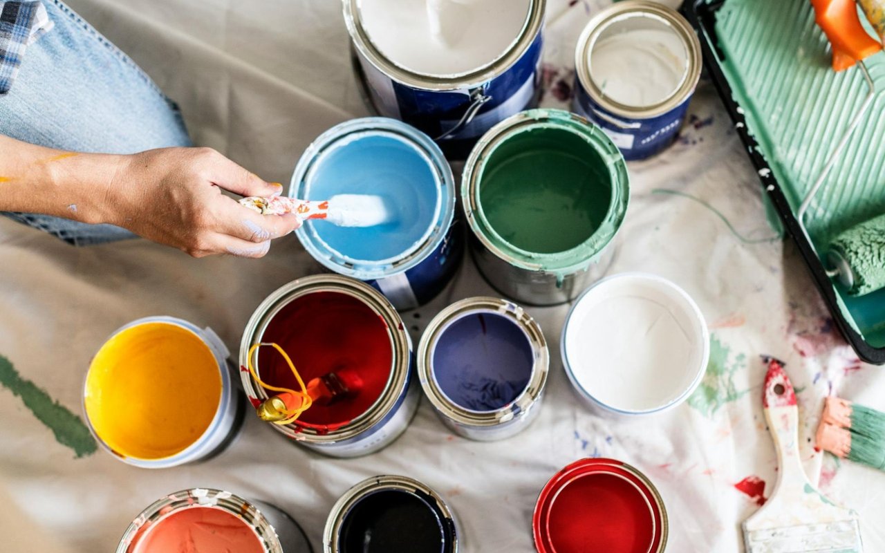
Color psychology refers to how different hues affect human emotion and behavior. While reactions can be subjective and influenced by culture or personal experience, certain trends are widely accepted. For example, blues tend to evoke calmness, reds signal energy and urgency, and greens promote balance and renewal.
In interior design, these emotional associations can guide how each room is painted and decorated. Choosing a palette based on the intended function of a space—not just current trends—ensures that your home supports both form and feeling. For homeowners in Coconut Grove, where indoor-outdoor living is key, this approach also helps create a cohesive flow between rooms and outdoor areas.
In interior design, these emotional associations can guide how each room is painted and decorated. Choosing a palette based on the intended function of a space—not just current trends—ensures that your home supports both form and feeling. For homeowners in Coconut Grove, where indoor-outdoor living is key, this approach also helps create a cohesive flow between rooms and outdoor areas.
Creating a Relaxing Atmosphere with Blues and Greens
If the goal is to make a space feel peaceful, serene, and grounded, blue and green tones are ideal. Blue—especially in softer shades like sky or powder blue—has been shown to lower stress levels and promote relaxation. This makes it a popular choice for bedrooms, bathrooms, and reading nooks. In deeper tones, such as navy or slate, blue can also create a feeling of sophistication and depth, perfect for a home office or formal dining room.
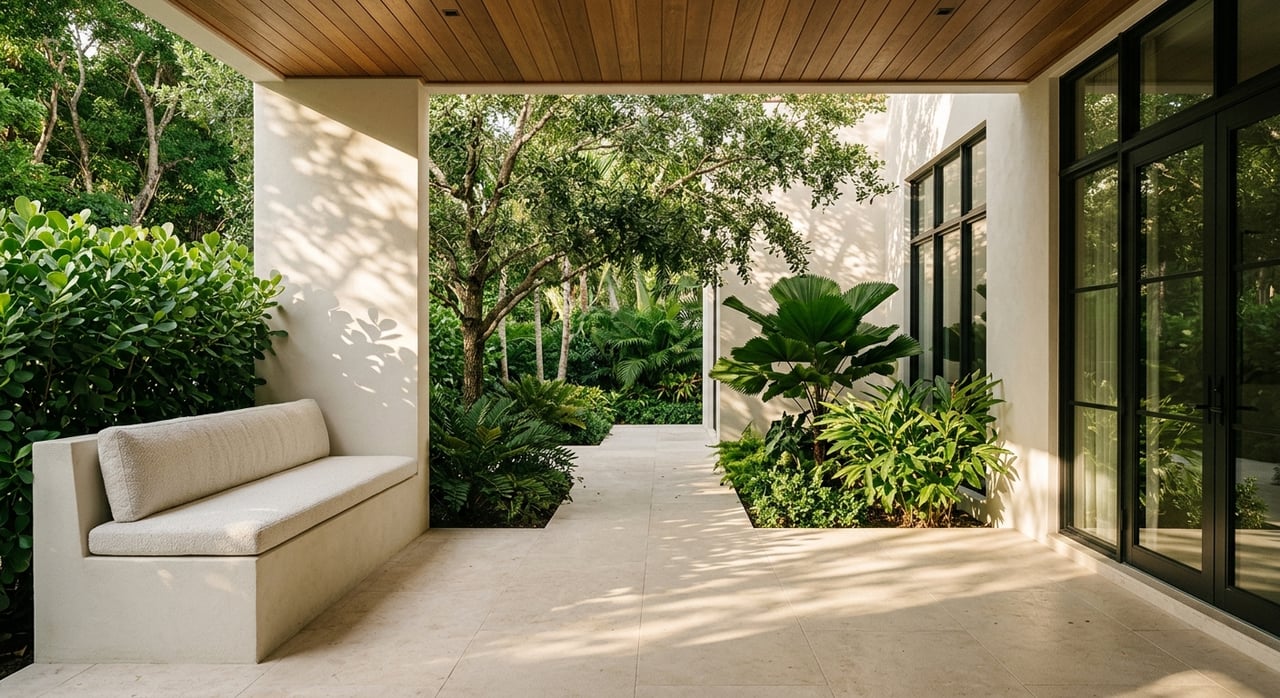
Green, associated with nature and renewal, brings a sense of balance and freshness to interiors. Sage and olive tones work well in kitchens and living rooms, offering a muted backdrop that feels natural and calming. For homes in tropical areas like Coconut Grove, green hues help connect interiors to lush gardens and outdoor living areas, reinforcing the region’s connection to nature.
Green, associated with nature and renewal, brings a sense of balance and freshness to interiors. Sage and olive tones work well in kitchens and living rooms, offering a muted backdrop that feels natural and calming. For homes in tropical areas like Coconut Grove, green hues help connect interiors to lush gardens and outdoor living areas, reinforcing the region’s connection to nature.
Energizing Spaces with Warm Hues
When designing rooms that are meant to feel lively or sociable, warm colors like red, orange, and yellow can make a significant impact. These hues stimulate the senses and can increase energy levels, making them suitable for gathering spaces like dining rooms, kitchens, or playrooms.
Red, used in moderation, creates a bold statement. A single accent wall or striking piece of furniture can make a room feel more dynamic without overwhelming the senses. Orange evokes enthusiasm and creativity, and it can be especially inviting in casual living spaces or entryways. Yellow, associated with happiness and warmth, is ideal for brightening smaller rooms or spaces with limited natural light.
In a coastal setting like Coconut Grove, using these colors strategically—paired with white or neutral tones—ensures that a home still feels breezy and open while gaining personality and vibrancy.
Establishing Elegance with Neutrals and Earth Tones
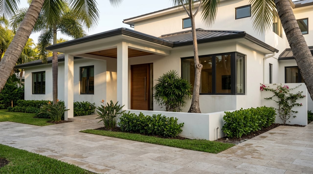
Neutral tones such as beige, ivory, gray, and taupe serve as the foundation of many timeless interiors. These shades offer flexibility and create a sense of calm sophistication, allowing artwork, furnishings, or architectural details to take center stage.
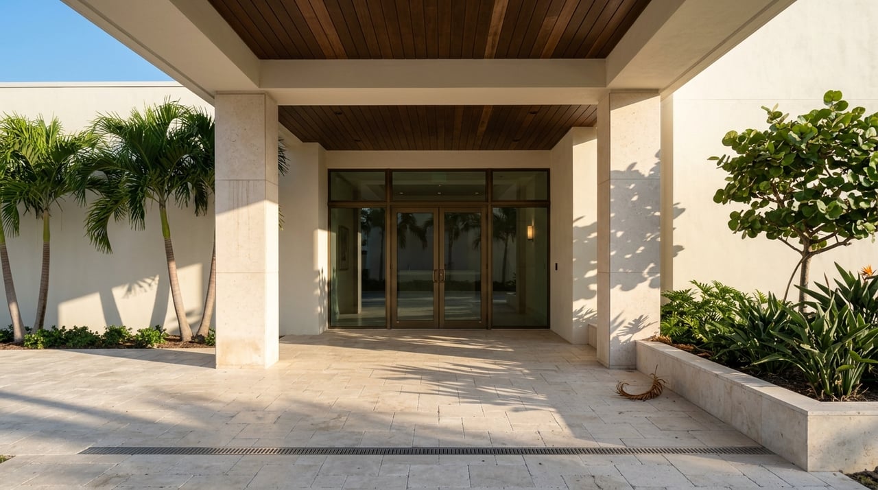
Earth tones, including clay, terracotta, and warm browns, are also seeing a resurgence. These colors evoke warmth and groundedness, making a room feel more inviting and anchored. In Coconut Grove homes, where Mediterranean and modern architectural styles intersect, earthy tones pair beautifully with natural materials like stone, wood, and rattan.
Layering these shades through wall color, textiles, and decor can make even large, open-concept spaces feel cohesive and welcoming without sacrificing elegance.
Using Color to Define Space in Open Floor Plans
Open floor plans are a hallmark of modern home design, especially in coastal communities where airflow and natural light are priorities. While open layouts are visually appealing, they can sometimes lack definition between functional areas.
Color is a useful tool for establishing boundaries within an open concept without needing walls. For example, using different but complementary shades in the kitchen and living area can visually separate the two while maintaining a harmonious flow. A darker tone in the dining area may create a cozy, intimate ambiance, while a lighter hue in the adjacent living room keeps the space airy and relaxed.
Color-blocking, where two distinct shades are used within the same space, can also add architectural interest and personalize the layout.
Reflecting Personality and Purpose
The most effective use of color isn’t just about aesthetics—it’s about expression. A well-chosen palette reflects the homeowner’s lifestyle and preferences, transforming a house into a meaningful, functional home. Bold jewel tones may suit someone who loves dramatic design, while soft pastels might reflect a preference for quiet simplicity.
Color psychology offers a framework to make informed design choices, but there’s always room for creativity. Even small additions—like colored tile in a backsplash, painted furniture, or accent walls—can enhance a home’s mood and elevate the experience of daily living.
Color psychology offers a framework to make informed design choices, but there’s always room for creativity. Even small additions—like colored tile in a backsplash, painted furniture, or accent walls—can enhance a home’s mood and elevate the experience of daily living.
Choosing the Right Finish and Lighting
The impact of color is influenced by more than just the hue itself. The finish—whether matte, satin, or gloss—can affect how a color interacts with light. High-gloss finishes reflect more light and are typically used for trim or cabinetry, while matte finishes absorb light and soften a room’s appearance.
Lighting also plays a critical role in how colors appear. Natural daylight tends to show the truest version of a color, while artificial lighting can cast warm or cool tones that shift a color’s appearance. Testing paint samples in different lighting conditions before committing to a full room is an important step to ensure that your color choices work harmoniously throughout the day.
Lighting also plays a critical role in how colors appear. Natural daylight tends to show the truest version of a color, while artificial lighting can cast warm or cool tones that shift a color’s appearance. Testing paint samples in different lighting conditions before committing to a full room is an important step to ensure that your color choices work harmoniously throughout the day.
Bringing It All Together
Color psychology is more than just theory—it’s a practical tool that can help homeowners design spaces that feel aligned with their needs and aspirations. From creating tranquil retreats to energizing entertaining areas, the thoughtful use of color brings a sense of intentionality to every room.
For those exploring Coconut Grove homes for sale or looking to enhance their current property, reach out to the Hidy Homes Team today. Their deep understanding of design and local lifestyle ensures expert guidance in finding or creating a home that looks beautiful and feels just right.
Other Recommended Reads: